Brand Identity: Elegance and Mystery
"La Cucina dei Gusti Impossibili" is a self-initiated project exploring what a brand identity and web presence could look like for a high-end, concept-driven restaurant. With no client brief or constraints, the challenge I set for myself was to build a coherent visual language from scratch — one that communicated elegance and mystery without becoming generic luxury.
The Challenge
Designing without a client means designing without guardrails. The risk is producing something aesthetically pleasing but disconnected from any real business need. To keep the project grounded, I defined a fictional but specific brief: a restaurant where the menu is a surprise, the experience is theatrical, and the brand needs to hint at what's inside without revealing it.
My Approach
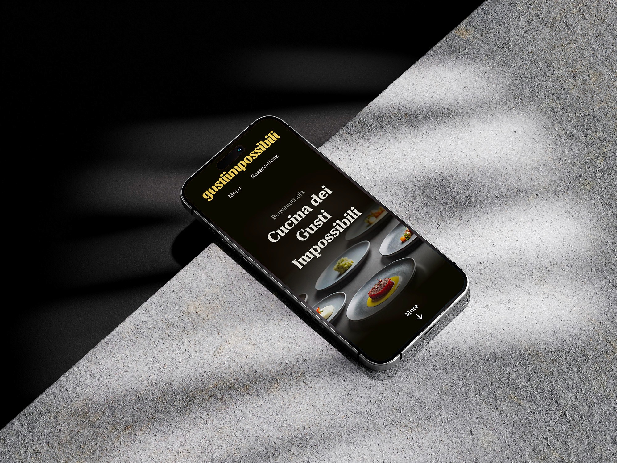
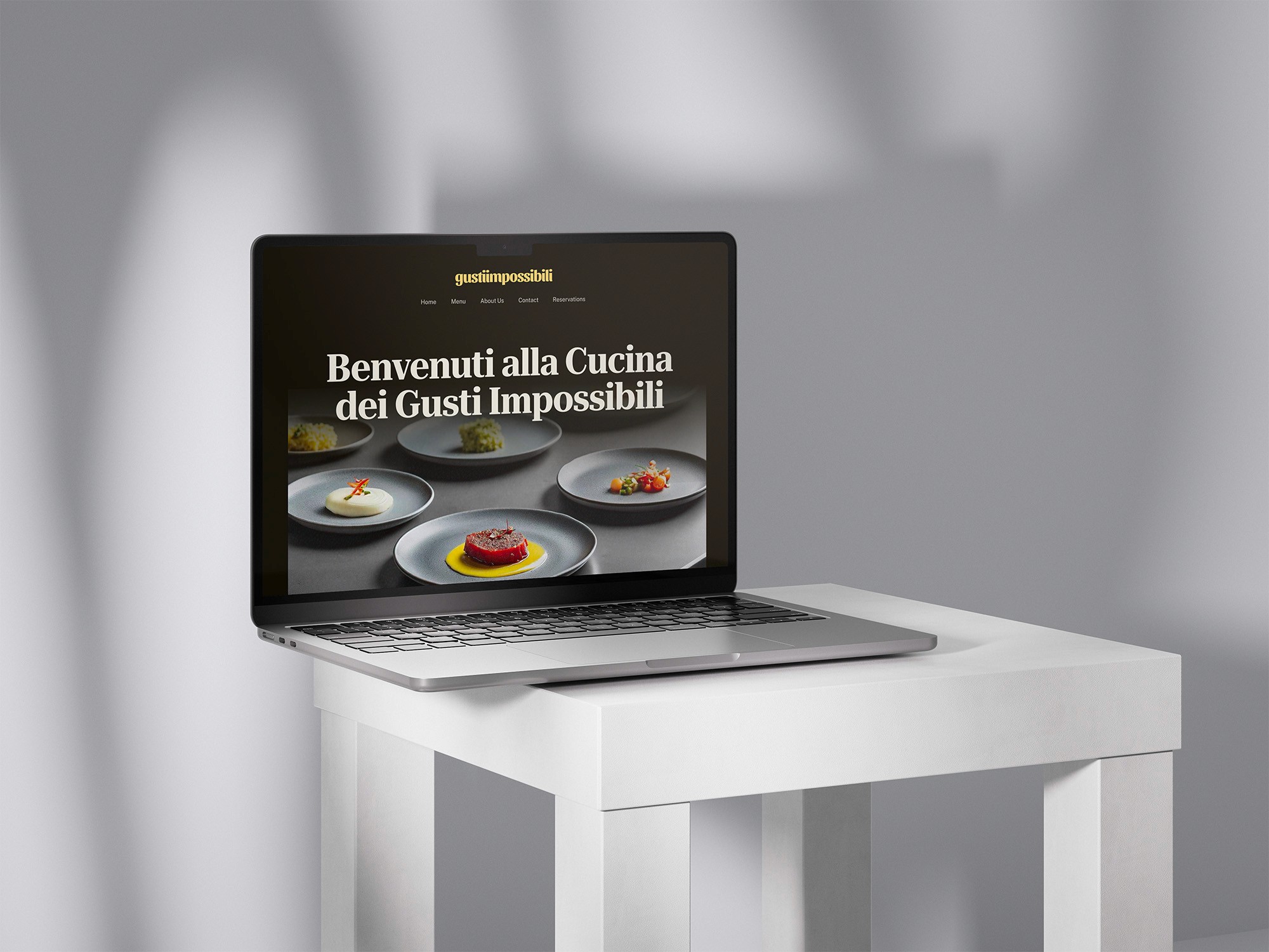
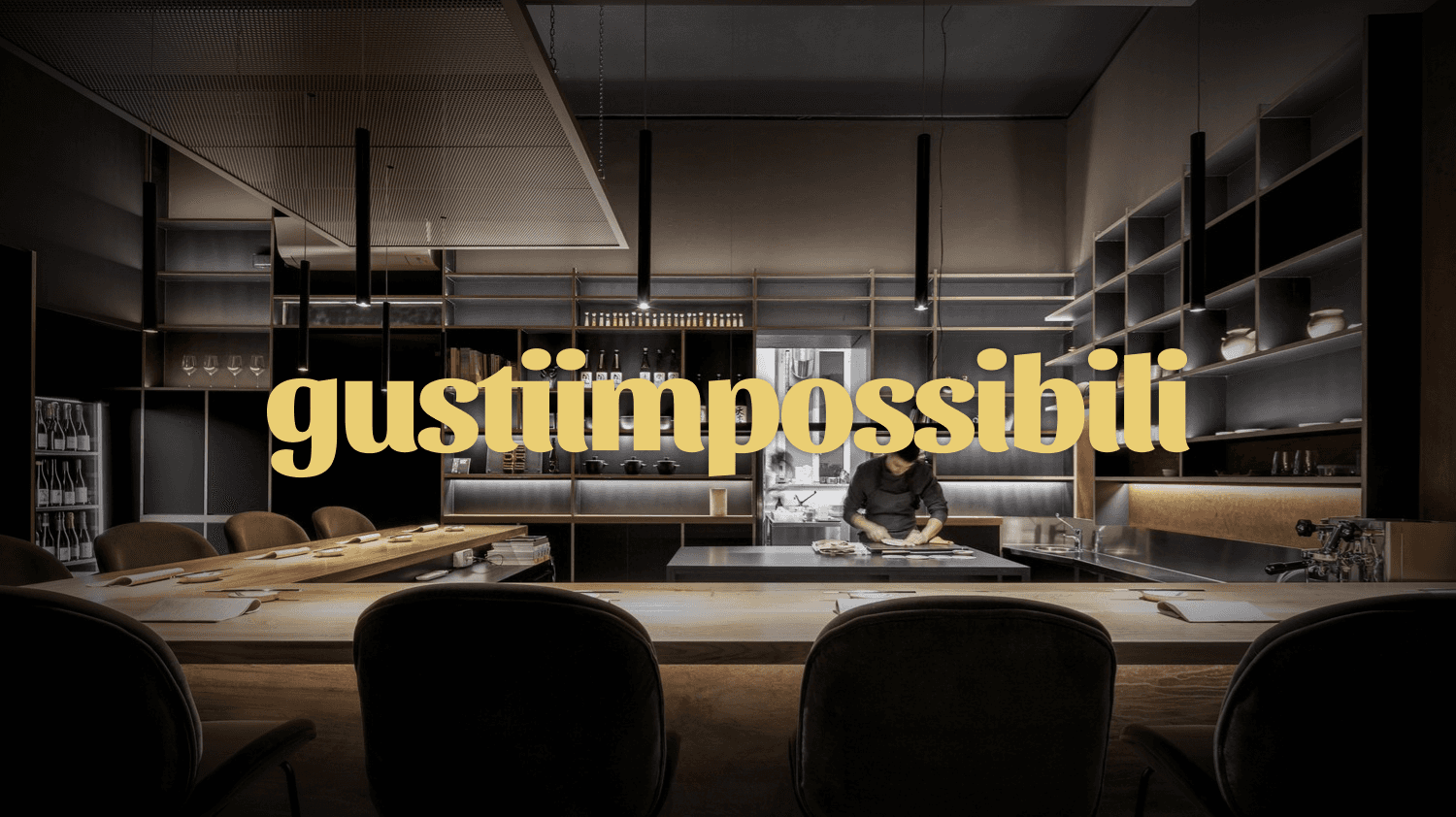
The core visual decision was the yellow and black palette — a combination that avoids the predictable deep red and gold of most fine dining brands while still communicating boldness and sophistication. Typography and layout were designed to create tension between minimalism and extravagance, reflecting the restaurant's concept of familiar ingredients treated in unexpected ways. The website mockup was designed as a visual exploration only, focused on hierarchy, mood, and how a user's eye moves through the page.
What I learned
Self-initiated projects are useful for testing ideas with full creative freedom, but they also reveal how much a real client brief shapes decision-making. Without constraints, every choice is arbitrary — which makes justifying those choices harder. It's a tradeoff I find valuable to be aware of.